
Below is an example from Itten regarding the strength of each color in relationship to its compliment. It is not a 50/ 50 relationship, they are not equal or balanced in half. This demonstration show how much of each color is needed to balance out its compliment in terms of optical area, but it also relates to mixing pigments.


Hue
Hue is the color quality of a pigment or object. Hue and color are interchangeable terms, but in color theory the term hue implies a specific discussion of only hue. For example a “light red” color has the hue of red and a high value.
Value
Value is the amount of light in a pigment or object. Color hues a have intrinsic value qualities.For example, yellow is the “lightest” or highest value hue.Blue-violet is the “darkest” or lowest value hue. Red has a more middle value. The value of a dark hue is made lighter by adding a higher value hue (or white). The value of a light hue is made darker by adding a lower value hue. Imagine the values of the hues below in a black and white picture.
Tints and Shades
Adding white to a color creates a tint. Adding black creates a shade. For example pink is a tint of red; maroon is a shade of red. See the tints and shades of blue below.
Intensity
Intensity is the amount of brightness in a pigment or object. This is a quality of pure hue that creates a visual vibration. Which green is more pure, or intense?
Tone
Tone is a hue mixed with gray.The gray will neutralize or tone down the color. This also decreases the hue intensity. Depending on the value if the initial hue, the addition of gray may also change the value appearance, making the hue lighter or darker.
Warm and Cool Colors
Temperature is an associate quality of color. In general warmer colors are orange, red and yellow. These colors “feel” warm and also emerge or move forward in space. Cool colors are blue, green, and purple. These colors “feel” cool and also recede or move back into space.
Now forget these categories and think more precisely in terms of relationships. A bit of color ying and yang, as warm color is defined by cool and vise versa! This means that in a comparison of red and blue, red is warmer. But in a comparison of red and red, one red will be warmer then the other.
Complimentary Colors
Complementary hues are defined as two hues, which create after-images of each other. Yellow has a blue-violet after-image and blue-violet has a yellow after-image. On most color wheels complimentary colors are across from each other. Placed next to each other compliment hues have the greatest possible contrast. When mixed together the result is a neutral hue.
The After image
The phenomena of after image causes the eye to see the complimentary hue after an extended period focusing on said hue. For example, stare at the yellow dot below for 30 seconds then look immediate at the black dot below.
Contrast of value.

Contrast of color value

Contrast of of hue.

Below are several examples of color delibirately used in still life. These are just some of the many possibilities.

In the example of Morandi, his color palette is derived from neutrals ( mostly greys and browns.) This does provide a unifying effect and in this case provides a tranquil slow experience.) His work is often mentioned in the context of without time...

This example by Chardin we can see a delibirate reliance on warms colors. This projects a sense of comfort and familiarity.

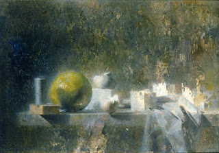
In the Murch example we see a strong contrast of color- the green apple and the rest of the gray/ white objects.


