Monday, April 11, 2011

TIME

With the inception of mark making came the ability to record events people and places. It became a tradition or "written record" of the past for future viewers. With that impulse, drawing continued for centuries. At various points in history it was important to capture a specific moment of a story or action and emphasis came to freezing the participants at the desired moment. Later, artists began to question or expand upon this convention, they became sensitive to time itself and the speed in a moment. Could it be stretched to seem active for an eternity? They became aware of the sense of time IN the artwork and not only its depiction. This could be a quality of time in the artwork separate, faster, slower, longer, endless than that of the viewer's world. Over the course of history it led to inventions of sequenced panels, stroboscopic movement, control of color and apparent space and a surface record (of accumulated movements of the artist) to address qualities of time. Below we see examples of artists addressing time in very individual ways.

Stroboscopic Photograph
Here we see the multiple moments of a motion. Within one picture we see more than a single moment captured, a sequence of positions indicating a beginning and end point.

Duchamp- Nude Descending a Staircase
Not unlike the previous example, we are able to see multiple positions of a movement sequenced and compressed into one picture. In a sense Duchamp captured a small passage of time, every instance existing simultaneously. It is comparable to a long duration photo.
Morandi
In this example we see an artist using composition, color, and space to hint at a feeling of time/ timelessness. By lowering the contrast, bring the colors to a neutral key, predominantly verticals and horizontal lines, we sense a slowing down of time, a stillness. The opposite would be a 'fast' experience- bright colors, lots of diagonals, heavy contrast.

Agnes Martin
Another example that hints at a sense of time or slowness this time without using representational imagery. The formal qualities mentioned in Morandi are clearly seen here again.

De Chirico
In this example, we see a space devoid of time. There is a sense of time of day (maybe evening-ish) but also a sense that it is always that same time. Some of this is accomplished by the light created and also the space. The space is vast and vacant. In the mind, time and space are linked, are larger space indicates a longer time to transverse it, or a slowing down.

Hopper
Hopper's example shows us the psychology of time. His people are usually alone and in a different time than others- the endless solitude of loneliness, or lost amongst others. There is always a quality in his work that this moment repeats (day in day out, meet at the same spot with the regulars always there etc.) and implies that this is a regular occurrence. An example of a moment presented to last indefinitely.

Bacon
Bacon found inspiration in stroboscopic photography. We can see a possible reference in his attempt to capture a portrait of a person. Is a person's likeness that frozen pose, or an organism moving about experiencing time? How would you convey this?

Bacon
One of Bacon's most famous work. A riff on Velasquez's Pope Innocencio X. Below you will see the original. But first think about how the figure is presented, the intensity of colors, the intense directional stroke, that emotion in the strokes. Again it appears to be a duration of time captured (along with psychological content) rather than the actual likeness of the person.

Velasquez and Bacon
Obviously two different takes on the same portrait of the pope (both with different agendas). One appears to capture the frozen moment and likeness, the other the accumulated moments frantic tortured psychology of a person. There is also the indirect time element of Bacon referencing a painting from long ago.

Damien Loeb
With this example I am referencing our next project- Cinematic History Redux. This artist takes images from movies and puts them together for his own purposes. There is an intense attention to detail and virtuosity of skill. But there continues the sense of movie time, part of a larger narrative playing out.

Damien Loeb
Another example of movie time. But what is interesting is the moment the artist chose. Is it a scene right before the films climax or a random choice. This brings to question what moment is important to freeze, which has the qualities you are seeking- build- up, climax, aftermath, random, etc.

Tuesday, March 22, 2011

Space to Content

Some examples below highlight the relationship of space to content. Some elements to consider are:

SCALE- Size as it relates to scale is very important. The space within a small paper can be infinitely grand and vice versa. Relationships of elements and marks create this relationship.
Large marks make the space feel small, tiny marks make it feel large. Massive architecture can dwarf the people that inhabit it. By orchestrating these relationships unique space can be created.

MOVEMENT- Space can function as a constant for the passage of time. In a drawing the space can be frozen and the movement of people (etc) can be contrasted against it. Space can be depicted as static, unmoving, fixed as other elements play out within it.

GAZE- Space can be created, not to provide a backdrop for a narrative, but to hold the viewers gaze; a place for it to enter. This allows the viewer to be the active participant and not solely an audience.


Piranesi


David Levine

Gustav Diore, from Dante's Divine Comedy


Arthur Melville

Rackstraw Downes

360 on Location

When encountering space we only see a portion of the full view. Limited by our cone of vision the brain works to weave together separate pictures in to one of totality of our surroundings. If one could see space all around them simultaneously, our concept of space would be very different. Rules of perspective would change and time might operate differently. Below are some examples that relate to this approach of depicting space.

The first example is a brief example of a large tradition of Chinese Scroll Painting. Artists have used this long horizontal format in various ways. Some depict a normal landscape view, other play out a narrative in successive scenes, and still others depict the passage of time from one end of the scroll to the other (Seasons change from one side to another.)

Ancient Chinese Ink Painting

The photos sent back by the Pathfinder Rover on Mars were taken and pieced together to create a large panorama. Notice the uneven overlap of picture edges, yet the image remains unbroken.
Mars Rover

Mars Rover

A 360 Photo in which space warps around the photographer. Notice the difference of the sun and shadow as you scan across the image.

360 landscape


Below are some student examples- unfortunately, the whole image was to long to use. A detail is provided and displays some of the spatial warping.

Student Example

Student Example

Sunday, March 6, 2011

Guernica Exploded

Guernica- Pablo Picasso 1937

Picasso created this painting in response to the April 26, 1937 bombing of Guernica in the Basque region of Spain during the Spanish Civil War. The bombing was carried out by German and Italian bombers at the request of the Spanish Nationalist Forces. Guernica has come to be a major anti-war symbol depicting the tragedy and suffering of people, particularly civilians

Lena Gieseke created an animated analysis of Guernica the Picasso Cubist masterpiece. Click here to see. Below please post your comments, impressions, reflections on the animated artwork and the painting. Consider how space has been used for emotional purposes, energy, politics, aesthetics, etc.

SPACE

The essential challenge of all artists working in 2 dimensions is the usage of space. It can be a challenge quickly addressed by acknowledging the flatness of the surface as modern painters did or delve into a myriad of choices of how space can be crafted. Such choices presented in art history include (but not limited to) realism/ illusionism, Byzantine, Pre- Renaissance, Renaissance, Cubism. All unavoidably deal with the issue of space selection, meaning and represent the thinking of that era.


John Singer Sargent

To understand this issue we first must look at the subjective nature of engaging space visually as humans. At best we can see just under 180 degrees ( an admittedly incomplete perception of the space that surrounds us.) Below are two examples from John Montagues's Basic Drawing Perspective.


Again remember our brain is comprehending information, in multiple ways, from an image projected upside down within our eye. From this information the brain uses conditioned responses to particular appearances of shapes and colors to process quickly. In this manner vision and it's subject are perceived. The very nature of the term perception, is the ability of the mind to grasp what is seen. The challenge in space depiction is the utilization of depth perception as it relates to:

COLOR (temperature, intensity, value)
CLARITY (focus vs blur)
SCALE ( relative size of objects)
SEQUENCING ( overlapping and placement of objects)
SHAPE DEFORMATION (the regularized shape in perspective and how the mind grasps these shapes as the vacillate between flatness and form)

Space and it's depiction is a loaded choice as it highlights and consciously omits/ edits certain information as it's expression needs. We all generally grow up being amazed by the simulacra ofillusionistic space, yet have unintentionally disregarded the multiple possibilities that space offers. It is the artists decision to make use of what best suits their "message" and equally important, enhances their perception of space, a skill necessary in engaging with all forms of 2 dimensional work whether it is advertising, fine art, design, illustration, photography. Below are examples highlighting some artists approach to handling space within these terms.

Thomas Moran

George Inness

Richard Parkes Bonington

The previous examples showcase an extreme depiction of spatial recession in the landscape format, foreground, middle ground and background. Atmospheric perspective is employed as we see colors of a more neutral hue in the background as well as cooler color and less contrasting values. Scale changes are evident as well as overlapping objects.

Richard Deibenkorn

In this example of Deibenforn we can see a tension between the flatness of the space and three dimensionality. It is a heavy "shape" composition which leans toward flatness, yet he employed a knowledge of color and values in spacial recession. Notice the shadows on the pavement.

Lucian Freud

Joan Semmel

Philip Pearlstein

The above examples display an approach to the figure in space through more traditional techniques. We see clear usage of sequencing particularly in Pearlstein (notice the mannequin behind, the in front of the model.) In the Semmel example she plays with the mirror (and extends the space) using color and scale. Notice the taper of the legs and the overlap. In the Freud example, we see clear overlaping of the body, foreshortening, color and scale (thigh/ knee to head ratio.)

Monday, February 14, 2011

Large- Scale Portraiture

Examples below demonstrate the scale we are attempting in this project as well as a concrete sense of form. This is the basis for your exploration into lighting the subject. A form and mass of the head must be indicated as you then begin to investigate light. Please click here to review Skull and Head Structure.

Olmec Heads from Mexican History


Kollwitz

Seurat

Lucien Freud

Andrew Wyeth

Chuck Close

Light in Portraiture

Deploying light as an active agent in art making is one of the fundamental basis for expression and meaning. Orchestrating both lights and shadows as active spaces in a composition begins to indicate a subjective perspective. Clearly choices are revealed, through illuminating presence and darken absence, as to what is important - object, location, time, narrative. It is the interplay of these two forces (shadow and darkness are not somehow lesser or simply defined by the absence of light, but rather are an elemental force, the diametric opposite, that yield and advance in balance with light) that create an overall tone. Below we see examples of how some artists from various mediums have used light to portray the figure for their own purposes.

In the photo of President Obama we see an ambient light, not too powerful or dramatic. It tries to convey a sense of integrity, strength etc. Presidents are always cast in a light that will not be overt, but more timeless, more classical.

A John McCain Photo from a magazine article pre -Election. The photographer got in a lot of trouble afterwards. From the vantage point and dramatic lighting we can see a subjective perspective of the person. McCain is presented as an overlord, ominous figure, clearly not a flattering portrayal. Notice the light from below and shadow up and behind.

In this example of Jesus Christ, the light is eminating from within. It is a supernatural light that radiates softly outwards giving the sense of purity, kindness, godliness etc.

In this example we see a frame from the Blair Witch Project, a more Baroque use of light, the figure dissolves into darkness. This use of lighting enhances the terror aspect of the subject and provides an environment for the emotion of the film- terror.

In this example we see an image from Sin City, by Frank Miller. Clearly the graphic use of light enhances the drama and grittiness of the content of the graphic novel. Notice the use of silohuette and how the darkness enters the figure.

Again we see a similar approach in Miller's Dark Knight novel. Batman, a character who walks the line between light and shadow (metaphorically), is displayed in that context visually.

In this example by Luc Tuymans we see a portrait with a strong light casting strong shadows. As is typical in his palette, we notice a slight wan quality or paleness. In the following example, we see another painting of Tuymans, in which the contrast is even more obliterated and we get an overexposed light quality. The sense is that light (usually used to illuminate, give form to objects) is overexposured and hints at the destructive power of light as it dissolves away detail and form.


Rembrandt is known for his Baroque use of light and often used its narrative potential. In this example we see a portrait of the artist and the light hints at his interior space, a place of brooding assuredness. The colors indicate candle light or evening light.
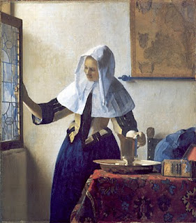
Working in Delft during troubled times in Europe, Vermeer crafted these paintings. Exquisite light delicately falling inside on the working people. They convey a pure, cleansing light, perhaps early morning and definitely Northern European light. All expressed by his choice of light, color, setting etc.